Pharma companies collect data from a wide variety of sources to use by many departments. But the goal is the same for all: to make better decisions.
Both data visualization and data analytics help companies do this. But they are not the same thing. It is important that teams understand the differences between data visualization and data analytics because although they work together very nicely, one without the other makes it significantly more difficult to attain strong results.
Let’s start with data visualization.
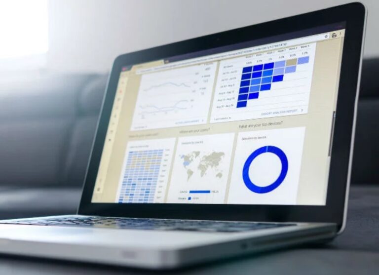
Data visualization tools like Qlik, Tableau and others are a huge leap forward for many companies, because they make big data easier to digest and understand. Beyond just simple charts, these tools can create just about any kind of visualization you can think of.
The value is pretty clear when you think about the alternative. Can you imagine trying to identify patterns or glean helpful insights from rows of raw data?
But, as with most things in life, you only get out what you put in. The visualizations are only as good as the data. If the data set is large, the visualizations may miss some important critical anomalies, but if it is too small, then everything gets logged as an exception to be checked. Even worse, if the data has just been uploaded directly, and hasn’t been properly cleaned and parsed, then the results will be skewed and erroneous.
However, here is where confusion often lies. Even if you are working with good clean data, a visualization tool will only do what it says on the tin — visualize data. It will not provide the critical insights into the whys, or how to change the results.
I’ve seen many run into this problem. They upload their CRM data, for instance, into a data visualization tool and expect it to drive better decisions. It doesn’t take long for them to become disillusioned. They feel they know what is going on but seem unable to change the results. This is because they missed a critical step of adding advanced analytics to the visualizations, and without this, they lack insight into the whys and how of changing it.
That’s where analytics come in. Transforming raw data into actionable insights requires people who understand the business issues to be solved and a process that combines advanced analytics, big data, and visualization along with the data science.
How to get better insights from your data
If you don’t know what to look for, finding insights within big data is harder than finding a needle in a haystack. It’s more like spotting a needle in the haystack without knowing it’s in there. Exceptional analytics combined with strong data visualization is critical for real world results for the teams using these tools. Here is the optimal process:
1. Data preparation
Advanced analytics makes the job easier by clearly defining the necessary inputs necessary for the specified task and analyzing the information based on those requirements – but this will only be as good as the data put in. The first task one needs to do, after understanding the business issue to be solved, is to prepare the data. Incomplete data, errors, and duplicates can sabotage your insights. That’s why all meaningful analysis happens only after the data has been thoroughly prepared and this means being sorted, structured, cleaned and imputed. This task is something done by either data scientists or big data engineers, or both, depending on the data structure. It often involves a variety of methods to remove errors and correct inconsistencies.
2. Advanced analytics to answer the business questions
This is where things get exciting. Using sophisticated algorithms, we can create models that accurately predict not just why something happened, but how different variables may affect the future results. For example, you could model how a change in advertising strategy would affect sales in a given territory. Or you could figure out what information patients or physicians are going to be asking for, before they ask.
With artificial intelligence and machine learning, we are able to analyze vast amounts of data and actually refine results each time the algorithm is run.
3. Communication
This is where the data visualization, and sometimes data visualization tools, come in. These tools provide the kind of visualizations necessary to help teams and management who don’t have analytics expertise make use of the data. When we get initial results from data scientists, they are just numbers and need to be translated into meaning for teams. This is often done with visualization. These visualizations often drive the communication.
Conclusion
If you’re using big data and simply uploading it into a data visualization tool without doing the pre-requisite data preparation and advanced data analytics, then you are treading a dangerous path that could give way at any moment due to a lack of real insights.
To take the required next step and get useful insights that drive real world results, your visualizations need to be combined with powerful data analytics driven by data scientists and subject matter experts.
To learn more, please contact the author at Eularis.
Found this article interesting?
To learn more about how Eularis can help you find the best solutions to the challenges faced by healthcare teams, please drop us a note or email the author at abates@eularis.com.